bimm143_github
My classwork from BIMM143 S24
Machine Learning 1
Muhammad Tariq
Today we explore the use of different data presentation tools on R like PCA
First up kmean()
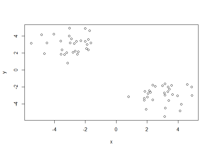
Demo of using kmean() function in base R. First make some data with a known structure.
tmp <- c( rnorm(30,-3), rnorm(30,3))
x <- cbind(x=tmp, y=rev(tmp))
plot(x)
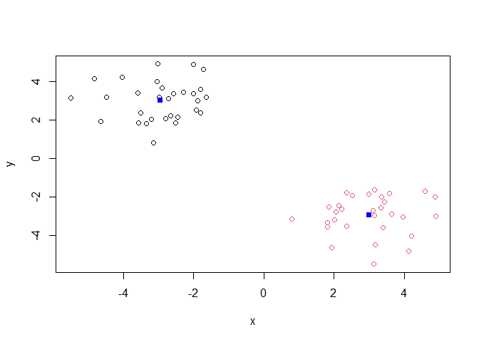
Now we have some made up data in ‘x’ lets see how kmeans() works with this data
k <- kmeans(x,centers = 2, nstart = 20)
k
K-means clustering with 2 clusters of sizes 30, 30

Cluster means:
          x         y
1 -2.948179  3.001639
2  3.001639 -2.948179

Clustering vector:
 [1] 1 1 1 1 1 1 1 1 1 1 1 1 1 1 1 1 1 1 1 1 1 1 1 1 1 1 1 1 1 1 2 2 2 2 2 2 2 2
[39] 2 2 2 2 2 2 2 2 2 2 2 2 2 2 2 2 2 2 2 2 2 2

Within cluster sum of squares by cluster:
[1] 57.94692 57.94692
 (between_SS / total_SS =  90.2 %)

Available components:

[1] "cluster"      "centers"      "totss"        "withinss"     "tot.withinss"
[6] "betweenss"    "size"         "iter"         "ifault"
plot(x, col=k$cluster)
points(k$centers,col="blue",pch=15)
Add more clusters to the plots
k <- kmeans(x,centers = 4, nstart = 20)
plot(x, col=k$cluster)
points(k$centers,col="blue",pch=15)
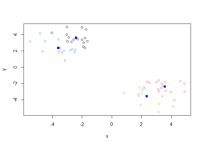
key-point; K-means clustering is supper popular but can be miss-used. one big limitation is that it can impose a cliustyering pattern on your data even if clear natural grouping dont exist- i.e it does what you tell it to do in therms of ‘center’.
Hierarchical Clustering
the main function in “base” R for hierarchical clustering is called ‘hclust’.
You can just pass our dataset as is into ‘hclust()’ you must give “distance matrix” as input. We can get this from the ‘dist()’ function in R.
d <- dist(x)
hc <- hclust(d)
hc
Call:
hclust(d = d)

Cluster method   : complete
Distance         : euclidean
Number of objects: 60
The results of ‘hclust)’ dont have a useful ‘print()” method but do have a speacial ’plot()’ method.
plot(hc)
abline(h=8, col="red")
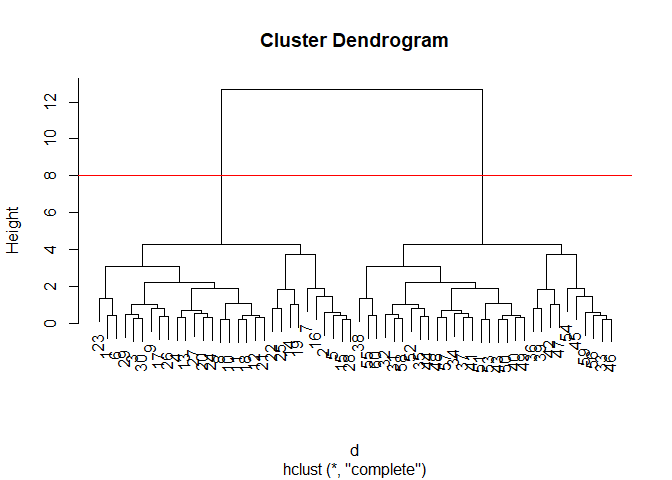
To get our main cluster assignmnet (membership vector) we need to “cut” the tree at the big goal posts
grps <- cutree(hc, h=8)
grps
 [1] 1 1 1 1 1 1 1 1 1 1 1 1 1 1 1 1 1 1 1 1 1 1 1 1 1 1 1 1 1 1 2 2 2 2 2 2 2 2
[39] 2 2 2 2 2 2 2 2 2 2 2 2 2 2 2 2 2 2 2 2 2 2
table(grps)
grps
 1  2
30 30
plot(x)

Hierarchical clustering is distinct in that the dendrogram (tree figure) can reveal the potential grouping in your data (unlike K-means)
Principal Component Analysis (PCA)
PCA is a common and highly useful dimensionality reduction technique used in many fields - particularly bioinformatics.
Here we eill analyze some data from UK on food consumption.
###data import
url <- "https://tinyurl.com/UK-foods"
x <- read.csv(url)

head(x)
               X England Wales Scotland N.Ireland
1         Cheese     105   103      103        66
2  Carcass_meat      245   227      242       267
3    Other_meat      685   803      750       586
4           Fish     147   160      122        93
5 Fats_and_oils      193   235      184       209
6         Sugars     156   175      147       139
rownames(x)<- x[,1]
x <- x[,-1]
head(x)
               England Wales Scotland N.Ireland
Cheese             105   103      103        66
Carcass_meat       245   227      242       267
Other_meat         685   803      750       586
Fish               147   160      122        93
Fats_and_oils      193   235      184       209
Sugars             156   175      147       139
x <- read.csv(url, row.names=1)
head(x)
               England Wales Scotland N.Ireland
Cheese             105   103      103        66
Carcass_meat       245   227      242       267
Other_meat         685   803      750       586
Fish               147   160      122        93
Fats_and_oils      193   235      184       209
Sugars             156   175      147       139
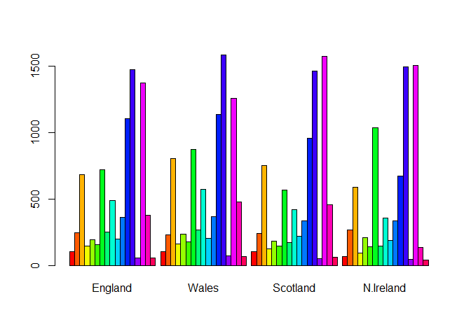
barplot(as.matrix(x), beside=T, col=rainbow(nrow(x)))
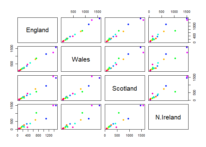
one conventional plot that can be useful is called a “paris” plot.
pairs(x, col=rainbow(nrow(x)), pch=16)
PCA TO THE RESUE
The main function in base R for PCA is called ‘prcomp()’
pca <- prcomp(t(x))
summary(pca)
Importance of components:
                            PC1      PC2      PC3       PC4
Standard deviation     324.1502 212.7478 73.87622 3.176e-14
Proportion of Variance   0.6744   0.2905  0.03503 0.000e+00
Cumulative Proportion    0.6744   0.9650  1.00000 1.000e+00
Interpretting PCA results
The ’prcomp() function returns a list object of our results with five attributes/components
attributes(pca)
$names
[1] "sdev"     "rotation" "center"   "scale"    "x"

$class
[1] "prcomp"
The two main “results” in here are ‘pca$x’ and ‘pca$rotation’. the first of these (pca$x’) contains he scores of the data on the new PC axis - we use these to make our “PCA plot”.
pca$x
                 PC1         PC2        PC3           PC4
England   -144.99315   -2.532999 105.768945 -4.894696e-14
Wales     -240.52915 -224.646925 -56.475555  5.700024e-13
Scotland   -91.86934  286.081786 -44.415495 -7.460785e-13
N.Ireland  477.39164  -58.901862  -4.877895  2.321303e-13
library(ggplot2)

#Make a plot of pca$x with PC1 vs PC2
ggplot(pca$x) +
  aes(PC1, PC2, label=rownames(pca$x)) +
  geom_point() +
  geom_text()
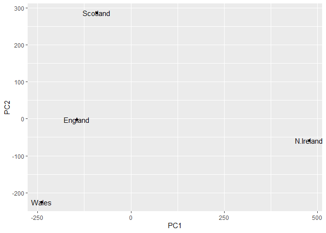
! PC1 enlightens the differnces in the rows, in how different the foods are consumed.
The second major result is contained in the ‘pca$rotation’ object or component. Let’s plot this to see what PCA is picking up…
ggplot(pca$rotation) +
  aes(PC1, rownames(pca$rotation)) +
  geom_col()
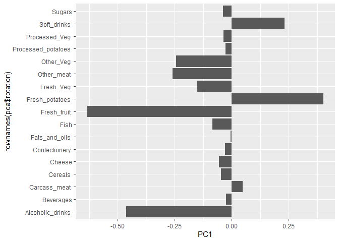
!it shows how which food is eaten so differently.